Hi guys! I’ve just finished a new project that I can’t wait to share with you! It’s another brand identity and logo design project for a brand named Siera & Celeste. I enjoyed sooo much every step of the design process that I’ve got so excited to get to the final point… and here we are!
After the interest shown for the article Branding and Logo Design – Behind the Scenes I’ve decided to include once again some insights from the design process. This time you will see the first drafts I have sent to the client. Enjoy!
Siera & Celeste
Some quick background info:
Brand Name: Siera + Celeste (final Siera & Celeste)
Tag line: Wear it Well (at first the client wanted a tag line included, but during the design process that was eliminated)
Activity: designer vegan leather handbag online store.
Target audience: adult women aged 25 to 55, compassionate to animals, interested in purchasing luxury designer handbags.
Keywords: feminine, luxurious, vegan and ethical.
Colors: deep plum, olive, and champagne.
After a few days of hard work (research, sketching, font searching and vector creation) I offered my client four options:

The lucky winner was Option #4 but at this point the client decided to try replacing the “+” symbol with “&”, and to eliminate the tag line. So, after these changes, the final logo looks like this:

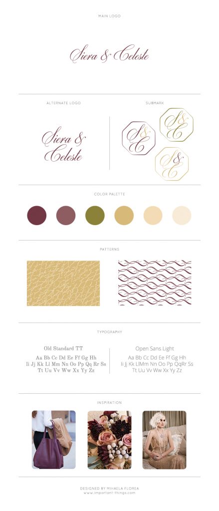
The next step was to choose the color palette and to design all other brand elements such as alternate logo, submark, pattern and selecting matching fonts.
Here you have the Brand Board with all these elements:

And finally, here you have some images that show the true beauty and elegance of the logo and mark:


That’s all for today. Thanks for watching!

