We are used to see different colors in our daily lives so we don’t pay attention to that anymore. One of the first things you learn about as a designer is color, so as a graphic designer and artist you start to see the life through colors. But what are colors?
The colors that we see are just the aspect of things resulted from the reflection of the light or the light they emit. The colors of tangible objects (whether it’s a real green apple or a painting of a green apple) are pigment based colors. On the other hand, the colors of objects viewed on a TV screen or a monitor are light generated colors. So the color of a green apple on your monitor is generated by the emission of green light photons.
Types of color
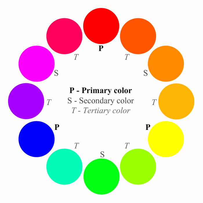
There are three types of pigment based colors which cover all the colors that we see each day:
- Primary colors: these colors cannot be made by mixing other colors. The primary colors are red, yellow and blue.
- Secondary colors: are the colors created by mixing the primary colors. The secondary colors are green (yellow + blue), orange (red + yellow) and purple (red + blue).
- Tertiary or intermediate colors: are the colors created by mixing the primary and secondary colors. Here we have colors like blue-green, red-orange and blue-violet.
In print, the primary inks used to create all colors are cyan, magenta, yellow and key (black), so the color system is called CMYK.
On the other hand, in web design, which is for screen purposes, the primary light colors are red, green and blue, so the color system is called RGB.
The RGB system has a million more colors than CMYK, so when choosing the color scheme for a design is very important to know the final purpose: web, print or both.
When choosing the color scheme for a design is important to have in mind the color meanings, because different colors have different meaning. But I will leave the color symbolism for a future post.

